
A color palette for clothes gives your wardrobe a clear identity. It helps separate random taste from reliable personal style. Many people think they need more clothes to look polished. Often, they need better color relationships instead. When shades work together, outfits appear more expensive and thoughtful. A small closet can suddenly feel flexible. A large closet can become easier to manage. The right palette also supports makeup, accessories, and outerwear choices. It creates consistency without making every outfit look identical. That balance is where personal style begins to feel natural.
Undertone shapes how fabric color interacts with your skin. Warm undertones often connect beautifully with cream, terracotta, olive, and golden brown. Cool undertones may respond better to charcoal, rose, sapphire, or crisp blue. Neutral undertones can borrow from both sides with careful balance. These are not strict rules. They are starting points for sharper observation. Try holding similar shades near your face. Compare tomato red with raspberry red. Notice which one clears the skin. A thoughtful undertone matching process makes subtle differences easier to trust.
Random shopping creates visual noise inside a closet. Each purchase may look good alone. Together, the pieces may refuse to cooperate. This is why people stand before full wardrobes and feel stuck. They have items, but not a system. Color gives the system its foundation. It connects tops, bottoms, shoes, coats, and jewelry. Without that connection, styling requires too much effort. With it, outfits become easier to repeat and adjust. A focused style color system turns personal taste into useful structure. The result feels practical, not restrictive.
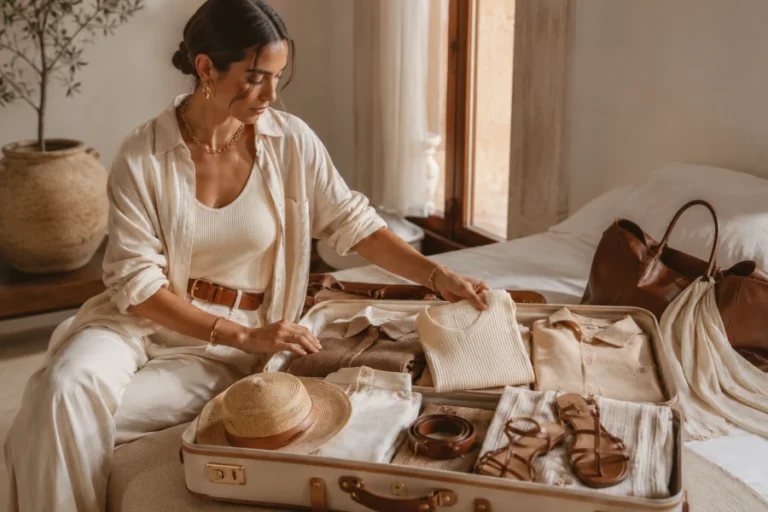
Capsule dressing depends on compatibility. A color palette makes that compatibility visible. Choose core neutrals first because they carry the most outfits. Then add accent shades that flatter your face and complement the neutrals. This approach prevents the common capsule mistake of choosing only safe colors. Personality still belongs in the palette. A bright scarf, deep green blouse, or soft lilac cardigan can define the mood. The key is coordination. Each accent should create several combinations. With capsule wardrobe colors, fewer pieces can produce more complete looks.
The mirror test works best when you compare, not judge. Try one strong color and one muted color in the same family. Observe your face before evaluating the garment. Look at your eyes, jawline, shadows, and overall brightness. A flattering shade usually makes the face appear more present. An unhelpful shade may pull attention downward. This test becomes clearer when hair and makeup stay simple. Keep the background neutral. Take photos if the difference feels uncertain. Over time, the results build a dependable reference library. That library becomes more useful than any single trend report.
Rules only matter when they improve daily dressing. Start by building two formulas around your strongest shades. One can be casual. Another can be polished. For example, a soft black trouser, ivory knit, and wine jacket may work beautifully. Another person may prefer tan denim, warm white cotton, and sage layers. The formula should feel repeatable without becoming dull. Accessories can adjust the mood. Shoes can change the setting. A smart wardrobe refresh begins with combinations, not isolated purchases. Style improves when color decisions become wearable.
Trends become less confusing when your palette is already defined. You can ignore colors that fight your natural coloring. You can adapt popular shades through accessories if they almost work. You can also wait for a trend to appear in a better version. This makes shopping feel selective rather than reactive. A strong palette does not block creativity. It channels creativity into choices that serve you. That difference matters for long-term style. Your wardrobe stays current without losing coherence. Each new item has to earn its place. That standard makes personal style stronger every season.



Leave a comment